Semi-Annual Post On Book Design
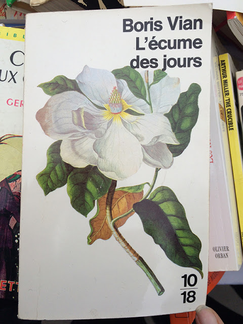
I'm working on a cover right now for a collection of short stories for children and young adults that the
is doing (in conjunction with the
Mid-continental Oceanographic Institute/MOI
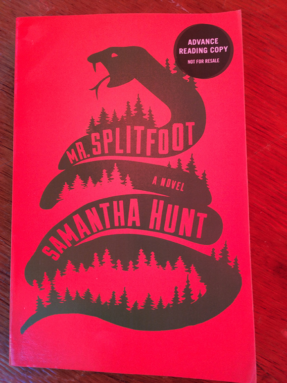
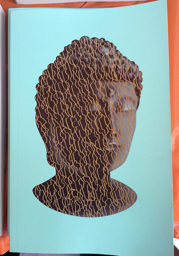
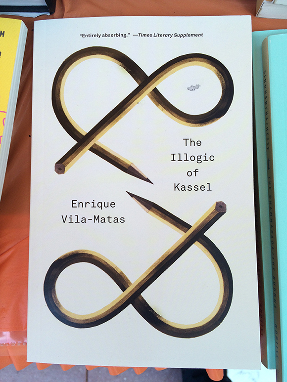
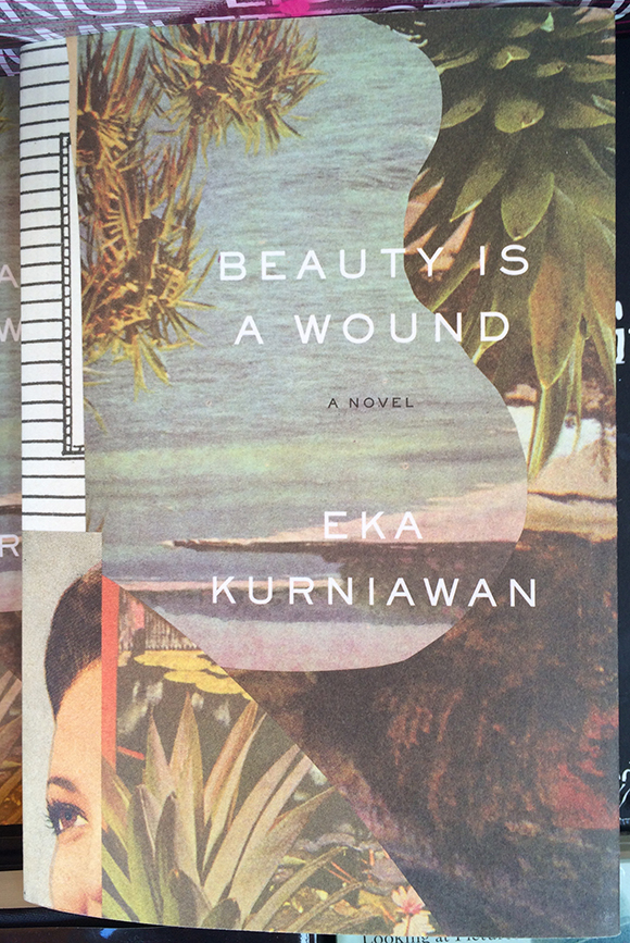
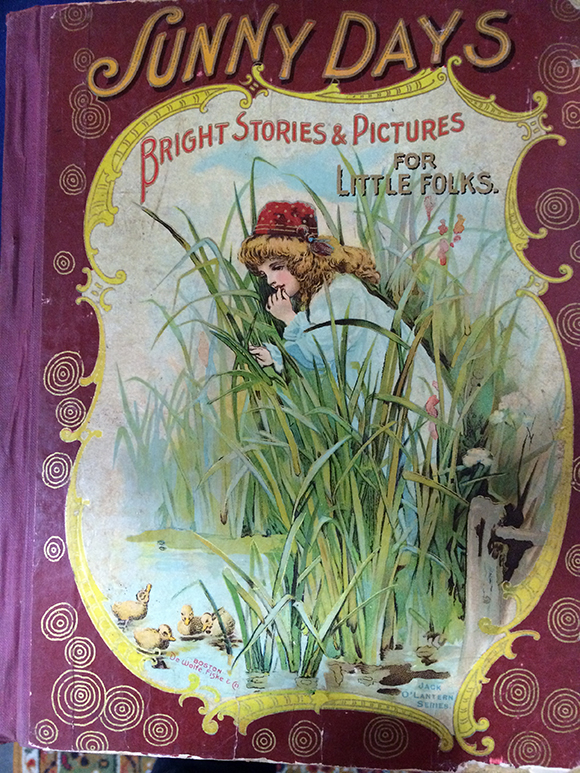
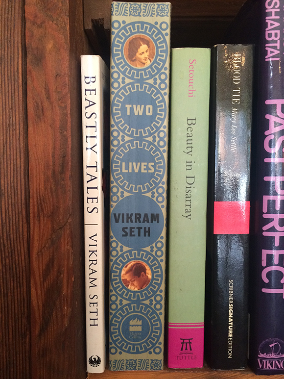
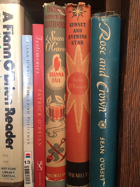
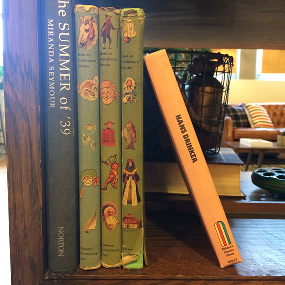
). For that reason I just went back to look at some of the stuff I've come across over the last few months for inspiration – when I'm out in the world I generally try and keep my eyes open for interesting book covers. The images below come variously from the Miami Book Festival, a flea market in Paris, an antique market in Portland and a hotel in Astoria, Oregon... and elsewhere. Along with covers I'm also especially interested in ways designers play with a book's spine,. In my opinion it's an under-appreciated aspect of the package. If only contemporary books for adults were as playful and visually interesting as the old-school YA spines shown toward the bottom of this post.
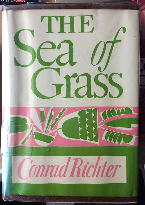
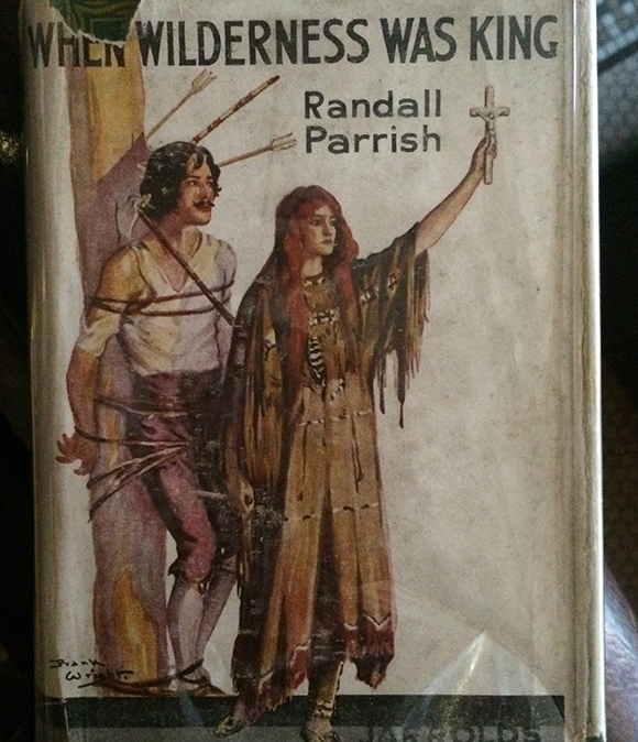
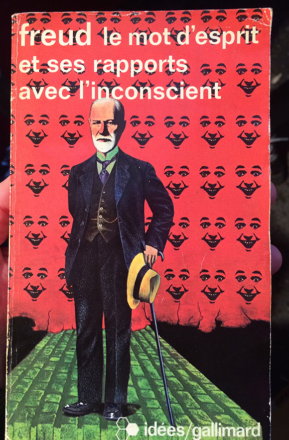


I love the silhouette images that make up the framing on these Doctor Dolittle books. These were especially fun to find because I am trying to do something vaguely similar with panelling in some comics I'm working on at the moment.

The next two images are of a nice use of a die-cut. From a magazine, not a book, but whatever.


And spines:
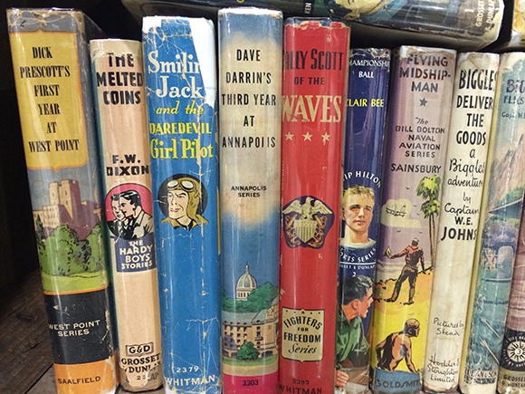
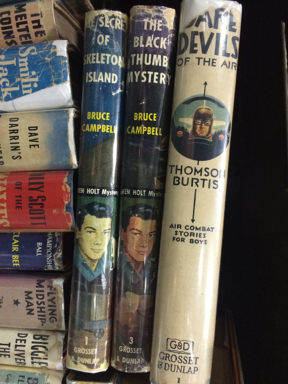


(My apologies to the various illustrators and designers who's names I am generally too lazy to track down/look up. Commenters please pipe up if you know)
